In what ways does your media product use, develop or challenge forms and conventions of real media products?
In the early research and planning stages I researched current music video’s and the conventions they had so I could then match them to my on ancillary texts. I first chose to analyse Rita Ora’s ‘how we do’ music video. The music genre was not really significant but the mise en scene of a party themed video definitely gave me inspiration. I wanted the music video to be ‘amplification’ meaning that no real performance of narrative would be present. In the video I wanted to re-create some of the party scenes in Rita Ora’s video as well as a Redlight Video I looked at to achieve this style of music video.
As well as finding music video’s that inspired me, I also came across a film named ‘Project X’. The film was targeted for young people aged 16-25 and features a young boy throwing a uncontrollable party. I really enjoyed the film and drew up some ideas e.g camera shots and casual costumes that could be used in my video. I also thought the idea of targeting a video towards people my own age would benefit me and would be something achievable. The films trailer features a similar dance genered song. From this, I could gain an appreciation of how short and precise the shots need to be in order to have a fast dance video that looks effective. In the final video I think the timing of shots worked really well and this is credited to the feedback on the draft.

.jpg)
After looking at many different digiapaks including some that had busy artwork on the cover or a simple motif, I decided to stick with the minimalistic style because this would develop normal digipak’s that would be relased by a dance band or artist. I used the vibrancy of colour that is sometimes a necessary convention that is needed for a product to be attractive for a consumer.
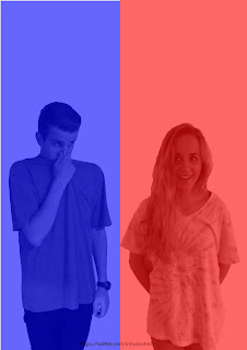
I came across a band (similar to mine) called ‘Bitte Orca Dirty Projectors’ and used the same colour scheme as they had on their digipak cover. The colours (red and blue) worked well with the female and male members of the band. However I have again, developed the convention on having a title on the front cover of a digipak, by not including it on mine. This resulted in my digipak havng a ‘striking’ appearance.
file://localhost/Users/mattiewhite/Pictures/media%20advert.jpg
For both my ancillary texts I used the same location infront of a projector screen to create the backdrop. I found this useful because any background could be presented onto the screen. This is something i have seen in other mainstream music videos and therefore used it in our video. Making it look slightly more professional.
 When trying to plan my album cover i researched many different bands similar to mine. The Pet Shop Boys album cover really displays the idea that 'less is more'. I liked it's simplicity and thought it would really stand out to a consumer. I took inspiration from their poses and contrasting facial expressions. As you can see with my band, their pose and expressions are similar to the style of the Pet Shop Boys.


A reasonable effort, but you will improve by being more specific about what inspired you from the texts e.g. mise en scene, camera angles etc MAKE SURE YOU HAVE THE IMAGES ALONGSIDE YOUR OWN TEXTS SO WE CAN SEE THE INSPIRATION. yOU REALLY NEED TO BE MUCH MORE EXPLICIT ABOUT YOUR INSPIRATION. (Sorry about caps!)
ReplyDelete