Wednesday 19 December 2012
Thursday 6 December 2012
EValuation 4 - Draft
How did you use media technologies in the construction and research, planning and evaluation stages?
The number of unique visitors to social networking sites (including Youtube) collectively is around 250 million per month. which means digital advertising is growing rapidly, with traditional marketing declining.
This is why we chose to use the following technologies to plan our ancillary texts, produce them and publish them in order to have the best results possible and keep up to date with contemporary technologies.
YouTube - We began to use Youtube to post our pitch that was presented to the class. Our Animoto was also posted onto Youtube, followed by our draft video and then final music video. By using Youtube we could share our work and progress with the world, as well as our classmates/teachers being able to access the site to view our ancillary texts.
Blogger - When creating our ancillary texts it was important that we could share our ideas visually with people. Blogger allowed us to do this throughout the research, planning and evaluation stages. It also helped that all our work, ideas and progress could be found in one place that could be referred back to. Blogger was also very useful when receiving feedback. People could simple visit our blog and comment on our work.
Twitter/Facebook- These are the two social networking sites we used. We decided to use social networking sites to gain 'fans' for the band and mainly to receive feedback from people who used the sites. Twitter was useful because it allowed us (during the research and planning stages) to follow bands of a similar genre/style to 'Intoxicated' and gain some inspiration from them. During the construction of our media texts we could also gain feedback via Facebook, either by posting the work or discussing it with Facebook friends.
Iphone's - Using Iphone's mean't that myself and Steph could communicate easily. Without communication between working partners our organisation would have been very poor and our work may have suffered. Being able to communicate using Iphone's mean't we could use the benefits of and Iphone such as FaceTime. This allowed us to plan when we wanted to film, who we wanted to include in the video, what song we wanted to use and so on. We also took photos of the band on our Iphone's which can be found on our Blog or on my Flickr.
Final Cut Pro - By using final cut pro on the Mac's at school we could work specifically on our music video. This technology offered us professional software for editing.
Imovie - Another software we used for editing was Imovie. This was used when constructing our Animoto. The reason i used Imovie was because it mean't the animatic could be finished at home using a Macbook Pro. Creating more time in lessons for research and panning. We decided not to use Imovie for our Music video because better software was available to us.
Photoshop - My skills on Photoshop have definitely improved during the construction of my ancillary texts. I used photoshop when making the Advert and Digipak. This included the enhancement of band images. Using Photoshop mean't that i could construct a piece of work digitally to enhance my ideas. Therefore i found Photoshop very beneficial.
HD Panasonic Video/stil camera - We used this piece of technology to film both our draft and our final video, making good use of what was available to us. My skills regarding camera work and framing improved during this process. The framing of shots had to be perfect due to us using the projector screen and working in small proximity. The camera allowed us to film a large amount of footage for it then to be uploaded onto a computer and edited.
Tripod- The tripod helped us also when framing shots by keeping the camera steady. It also make enabled the filming to be more mobile.
Macbook pro - Having the advantages of using a Macbook Pro mean't that when planning i could make the animoto in my own time. This was useful because i could focus on my reattach and planning of my other ancillary texts in lesson time. The MacBook Pro also came in handy when researching different music genres, bands, and band style. Photos of the band could also be uploaded onto the Macbook Pro and images could be enhanced using iPhoto. I could also easily access my blog through using this piece of technology. I could also work on my digipak and advert at home by downloading a trial of Photoshop which was very useful for me.
PC - The PC's where only really used at school, to blog ideas and research in the early stages on the task.
Projector screen - When filming our music video the location provided us with a large projector and 'cinema screen'. We didn't initially plan on using this piece of technology but when setting up to film we tried out a few different background and connect the Macbook Pro unto the projector by using a HDMI wire. After trying out a few different backgrounds we selected the ones we liked best and thought they looked really effected with the band stood in front on the screen.
Storyboard- Before constructing our ancillary texts we had to put our ideas down on paper. This meant drawing shots we wanted to include in the video, putting them into order of preference and then taking photos of each drawing they could be put into our animoto.
CD's and digipaks - During the research and planning stages i researched many different digipaks in order to acknowledge the real conventions of real media products. I was also inspired by different colour scheme, fonts, layouts and what the digipak actually contained e.g whether it included lyrics, thank you lists, acknowledgements, credits or 'the making of' the album.
flikr - Flickr was a useful technology i used that enabled me to share photos of the band. Meaning people could access the photos, give us feedback and we could share the images onto social networking sites and blogger. Flickr allowed me to upload a large amount of photo's so i could then chose which ones i wanted to use for my digipak and advert.
The thought of constructing our ancillary texts without the above technologies would definitely have been a struggle and even unrealistic. Although by using the technologies we could make a product 'brand' that actually uses conventions and looks like a real media package.
Wednesday 5 December 2012
Evaluation 3 - Draft
What have you learned from your audience feedback?

When we first pitched our ideas to classmates and teachers, they seemed to be exciting at the prospec of having a party video. However there were a few concerns about how we would film the party scenes so we could create the illusion that 50+ were present when actually there were only 8. Also the mise en scene had to look effective/realistic and this was stressed by teachers and peers after our pitch.
Feedback from a variety of sources meant that i could take the advice from others and work on improving all pieces of work. I received feedback for my ancillary texts through different methods. This included Twitter, Blog posts, Facebook, Youtube. Through using the internet i could gain feedback on all ancillary texts form peers, teachers and the public. Overall my work has had a positive reception. However getting to the end result was not without changing a few of my original ideas/plans...
Feedback from our teachers and verbal feedback from our peers was very useful when showcasing our draft ancillary texts. The feedback was very constructive especially with our video, where we originally had many different shots of 'party' scenes that didn't work too well. My digipak also received helpful feedback concerning the colour scheme that was completely changed in my final draft. From the feedback on our draft ancillary texts we could really appreciate how important feedback is order to have a fantastic end media product. After listening to the feedback on our draft we re-shot some of the scenes with the female lead singer in order for her lip-syncing to be perfect. We then started from scratch again on Final Cut because a different beginning and end wad needed. Otherwise the video looked very amateur.
The bands Twitter account was created in the hopes that a range of feedback from the large variety of people could be received by people using the social networking site. However gaining feedback by using this site was slightly restricting because only the people who followed 'Intoxicated' could actually comment or even see the work.
Another way the i could gain feedback especially on the music video was through blogger. Classmates and peers comented on the final video and presented there ideas to us.

We constructed an animatic in order to get an estimate of timings and camera shots. The feedback on our animatic storyboard helped us further to get precise timings and possible camera shots that could be achievable and realistic. Although we changed the order of camera shots, cut some out completely and added others, it was still a useful process.
Our pitch enabled us to display our ideas to our classmates and teachers. Some initial concerns regarding, mise en scene, the amount of extras for the video and lighting issues where addressed to us so we could overcome the problems before we started filming. The feedback we received on our video from our peers was mostly positive and they thought the 'minimalistic party worked well.'
Evaluation 1 - draft
In what ways does your media product use, develop or challenge forms and conventions of real media products?
In the early research and planning stages I researched current music video’s and the conventions they had so I could then match them to my on ancillary texts. I first chose to analyse Rita Ora’s ‘how we do’ music video. The music genre was not really significant but the mise en scene of a party themed video definitely gave me inspiration. I wanted the music video to be ‘amplification’ meaning that no real performance of narrative would be present. In the video I wanted to re-create some of the party scenes in Rita Ora’s video as well as a Redlight Video I looked at to achieve this style of music video.
As well as finding music video’s that inspired me, I also came across a film named ‘Project X’. The film was targeted for young people aged 16-25 and features a young boy throwing a uncontrollable party. I really enjoyed the film and drew up some ideas e.g camera shots and casual costumes that could be used in my video. I also thought the idea of targeting a video towards people my own age would benefit me and would be something achievable. The films trailer features a similar dance genered song. From this, I could gain an appreciation of how short and precise the shots need to be in order to have a fast dance video that looks effective. In the final video I think the timing of shots worked really well and this is credited to the feedback on the draft.

.jpg)
After looking at many different digiapaks including some that had busy artwork on the cover or a simple motif, I decided to stick with the minimalistic style because this would develop normal digipak’s that would be relased by a dance band or artist. I used the vibrancy of colour that is sometimes a necessary convention that is needed for a product to be attractive for a consumer.
I came across a band (similar to mine) called ‘Bitte Orca Dirty Projectors’ and used the same colour scheme as they had on their digipak cover. The colours (red and blue) worked well with the female and male members of the band. However I have again, developed the convention on having a title on the front cover of a digipak, by not including it on mine. This resulted in my digipak havng a ‘striking’ appearance.
file://localhost/Users/mattiewhite/Pictures/media%20advert.jpg
For both my ancillary texts I used the same location infront of a projector screen to create the backdrop. I found this useful because any background could be presented onto the screen. This is something i have seen in other mainstream music videos and therefore used it in our video. Making it look slightly more professional.
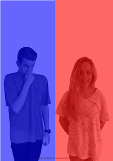
 When trying to plan my album cover i researched many different bands similar to mine. The Pet Shop Boys album cover really displays the idea that 'less is more'. I liked it's simplicity and thought it would really stand out to a consumer. I took inspiration from their poses and contrasting facial expressions. As you can see with my band, their pose and expressions are similar to the style of the Pet Shop Boys.


Evalatuion 2 - draft
As far as creating a 'brand' for our band 'Intoxicated', i wanted to have an easily recognisable dance/elctro band. The digipak originally had a green colour scheme that was created by photographing the band infront of the projector screen used in the video. However i wanted to use real media products that could inspire me such as Bitte Orca Dirty Projector.
The colours used are still bold but not as distracting as the bright green that i was originally going to use.
The red and blue colour scheme on the Digipak and Advert suits the genders of the band and continues to keep a simplistic approach to my ancollary texts. I think the the colours would be recognisable, especially from a 'dance' band who, (judguing form my reasearch) don't use this minimalistic style and this was shown in our vidoe also.
The font used on both the my ancillary texts was intentionally used to match the simplistic approach and create a 'clean' professional look that could contrast to the bands casual style.
From the research and planning stages, it became apparent that the style of a band does attract people an in certain videos the male gaze was achieved by the artist/band wearing contemporary, revealing outfits. The outfits used in real media products would. The costume/style of our band is casual in order for all the ancillary texts to be, in a way 'timeless'. Without people really judging the band on what they look like or what/who they're wearing.
By having the record label on the Advert people can recognise


.jpg)

I have created the concept of a 'star image' by having the girl in the video making direct eye contact with the audience by looking into the camera. She is also the only singer. The boy had the role of 'dj' and doesn't actually engage with the audience on either of my ancillary texts.
Monday 12 November 2012
Photo's of the band


MattieOlivia's photostream on Flickr.
Here are a few photo's of the band. I used one of these for my draft digipak but then decided not to go with the green background. Therefor i have used the two individual photo's and put them together on photoshop.
Friday 9 November 2012
.jpg)

Album notes
I found the following link helpful when making my Digipak
http://www.entertainerlaw.com/pdf/albumnotes_101.pdf
Thursday 8 November 2012
Advert in progress

I am constructing the advert using photoshop. I've decided to go with the red and blue colour theme that complement the male/female genders in the band. My advert will continue to have a simplistic look.
I need to include:
Band name
Album Name
Star rating (and music magazine name)
sony logo (music label)
Iphone detection code. (This will take people straight to itubes where they can buy/pre-order the album.
Mattie & Steph coursework: Digipak progression
Mattie & Steph coursework: Digipak progression: As you can see i've moved the track listing onto the inside cover to keep the outside minimalistic. I have also added a few tacks to match...
Digipak Inspiration


This Digipak from Flying Lotus is similar to mine in the sense that the band name is not featured on the cover but instead it's on the spine. The back cover is also very minimal with only the legal information and artwork. My back cover will also just feature the legal information.


Digipak Design 2

Wednesday 7 November 2012
Cover ideas for digipak


After looking at many different covers, i've been drawn to this American band (similar to mine). The artwork for their cover was desinged by Rob Carmichael, who runs Catsup Plate Records and has created art for artists such as Animal collective and Atlas Sound. The colours used are still bold but maybe not as distracting as the bright green.

Monday 5 November 2012
Digipak draft feedback

Track list
1. inhalate and intoxicate
2. beautiful addiction
3. Mind Games
4. everything you want
5. heads will roll (a-trak remix)
6. plastic faces
7. Below and above
I have decided to put the track listing on the back covr of the digipak. This way, if people were to pick up the product in a shop they can easily see what tracks are featured and this could be a good selling point if they're favourite song is on the album. The reason the track listing isn't on the inside covers is because on the inside left cover there will be some lyrics of the songs.
Monday 29 October 2012

Saturday 27 October 2012


.jpg)
Cover Art

Thursday 18 October 2012
Disclosure album cover


I have taken inspiration from the Disclosure album cover. The two band members faces have been enhanced and drawn on with a small white brush tool, presumably using photoshop or similar software. This is a really unique but simple enhancement and something i haven't seen before so i wanted to recreate it and use the technique on 'intoxicated'. I am undecided as to wether i would want this image on the digipak or poster as it does look very ammeter. Then again the simplicity of it really works well.
Wednesday 17 October 2012
Digipak Design in progress

I am using Photoshop to design my digipak. I have taken this hand print from Google and used it as a recurring motive in the package as it is on the front cover and left cover of the digipak. For the final digipak i will take a photo of my own hand print and enhance it using photoshop. I wanted to create a simplistic digipak and the exterior of it show's this idea. However i have used the flurecent green colour (taken from photo) as a background to the inside. This shock of colour i think would look really exciting when someone opens up the digipak.
I don't like the idea that some people buy an album just because they like the look of the band. However i do think a photo would be important. Therefore i have included a photo of the band and placed it behind the where the CD would be.
Due to the simplistic approach i am trying to take with my digipak i will not be including credits or thank you lists. The back cover simple reads the names of the song. If the consumer of an album wants to find out more about the band e.g pictures, making of the album, thank you lists, lyrics, or video's they could head to the bands website or blog.
Monday 15 October 2012
Design Template

Digipack ideas
What designs am i having and where?
Photoshop design of handprint on the cover with band name and album name
Image of boy on the left side of the inside and girl on the right. Imaged will be black and white and cut out on photoshop.
Fonts?
I have found two fonts that I really like from DaFont. The fonts are quite simple and classic which in my opinion would contrast well to the colour scheme and music.
Alien league
Altera
Monday 8 October 2012
Cover Ideas

I have created this album cover idea using photoshop. I wanted to create a simplistic cover that matched the dance/pop theme of the song. I really like the mix of colours used, it is not gender defined. Meaning possibly a greater, mix gendered audience compared to an album that was all pink.
The hand print is an image i found, although it wouldn't be too difficult to create something similar on photoshop.
Record Label
I have chosen the band 'Intoxicated' to be signed to Sony Music Entertainment. Sony are an international company and well respected company. Sony music and entertainment was founded in 1929 and became the American Record Corporation. Sony music Entertainemnt is a wholly owned subsidairy Corporation of America but is also the mother company of Colombia Records.
Some of Sony's UK artist's include:
Alexandra Burke
Paloma Faith
Dry The River
Rita Ora
Chipmunk
Diasy Dares you
Labyrinth
I think that the artist's signed to Sony UK would match the created band 'intoxicated' because the music genre (dance/pop) is similar to those listed. Sony is also well established internationally known, broadening the target audience margin for my band.
Wednesday 3 October 2012
Font Ideas

Here are some fonts ideas of the band name that could be used for the album cover . The first font matches the dance genre quite well although I wanted to do something different with the presentation of a dance track. Therefore the second and third are probably my favourite and more simplistic.
Album cover ideas


Here i have found a few inspirational vinyl cover's that have given me some ideas for my own. There's a mixture of some classic album artwork such as the Pink Floyd 'Dark side of the moon' as well as some fairly abstract covers. I have still not yet decided weather i want a photo or artwork on the cover, but i do want a simplistic approach to juxtapose the song.
Subscribe to:
Posts (Atom)